-
Help Support The Rugby Forum :
You are using an out of date browser. It may not display this or other websites correctly.
You should upgrade or use an alternative browser.
You should upgrade or use an alternative browser.
Club Kits
- Thread starter TRF_Olyy
- Start date
- Joined
- Feb 28, 2012
- Messages
- 2,077
- Reaction score
- 943
Don't dislike that at all, but definitely has more of a 7s than XVs vibe to it imo
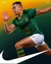
Had forgotten the Boks were with Nike - jealous!
Had forgotten the Boks were with Nike - jealous!
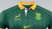
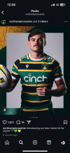
Like that. Love it when logos match the shirt. Horrible when they don't, think Saints tool-station.New Springbok kitsView attachment 23891
View attachment 23892
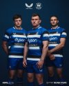
The away kit is an improvement of the old oddly colored one we had. Our home kit is generally fine… but I still prefer the collar of the last MTN kit with the gold accents on the arms
SA's electric blue shirt will always be my fave
- Joined
- Feb 28, 2012
- Messages
- 2,077
- Reaction score
- 943
Wondering if it is just a typo, but it is quite weird that the wording underneath the Springbok is just “Springbok” and not “Springboks” or “The Springboks”
- Joined
- Dec 22, 2014
- Messages
- 4,644
- Reaction score
- 2,517
Always does I think?Wondering if it is just a typo, but it is quite weird that the wording underneath the Springbok is just "Springbok" and not "Springboks" or "The Springboks"
- Joined
- Feb 28, 2012
- Messages
- 2,077
- Reaction score
- 943
See my profile pictureAlways does I think?
- Joined
- Nov 25, 2010
- Messages
- 5,780
- Reaction score
- 2,171
- Joined
- Nov 25, 2010
- Messages
- 5,780
- Reaction score
- 2,171
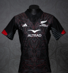
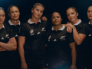
looks even better in their official photos, i do love these ones that have loads of details up close....but on camera will broadly be "Black"View attachment 23886

Māori All Blacks Jersey 2025
www.allblacks.com
Unreal, comfortably the best shirt of the season

- Joined
- Feb 28, 2012
- Messages
- 2,077
- Reaction score
- 943
Some of the more recent ones are singular! Wonder when/why it changed
Weirdly think I found the difference - All the shirts available to buy online say Springboks (including the match day replica kits) - but the actual kits that the players are playing in are different and only say Springbok - Guess it is a way to identify if something is indeed a match worn jersey
- Joined
- Feb 28, 2012
- Messages
- 2,077
- Reaction score
- 943
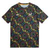
Oh my eyesOh wow - I've just seen the warm up kit and that's something I think needs to be shared...
View attachment 23906
Blind opponents before the game kicks offOh wow - I've just seen the warm up kit and that's something I think needs to be shared...
View attachment 23906
- Joined
- Jan 3, 2017
- Messages
- 1,428
- Reaction score
- 577
Make it tonal and make it bottle green for the home shirt.Oh wow - I've just seen the warm up kit and that's something I think needs to be shared...
View attachment 23906
Then use the design with a white base for alternate.
- Joined
- Jan 3, 2017
- Messages
- 1,428
- Reaction score
- 577
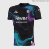
Since the end of the Bristoil Sport in-house kit deal they've kept the 2 clubs stylistically separate. Id bank on the Bears Euro shirt being black but outside from that I'm not sure how close they'll end upNew Bristol City 3rd shirt reminds me of Bears shirt of a few years ago. Maybe the Bears could have a similar shirt for Europe.
View attachment 24073
- Joined
- Apr 12, 2015
- Messages
- 7,571
- Reaction score
- 5,288
Hate the circular collar on Macron kits
- Joined
- Apr 12, 2015
- Messages
- 7,571
- Reaction score
- 5,288
True sayHate the circular collar on Macron kits


