Welcome to the world of Northampton Saints rebranding badges.Not a kit, but closest thread. Stormers changed their logo, and no one is happy (old versions on the left including the old 90s version, new one on the right). Looks like the old Super Rugby logo and DHL is way too prominent. Just is really disconnected from the old version.
View attachment 24354
-
Help Support The Rugby Forum :
You are using an out of date browser. It may not display this or other websites correctly.
You should upgrade or use an alternative browser.
You should upgrade or use an alternative browser.
Club Kits
- Thread starter TRF_Olyy
- Start date
- Joined
- Jul 16, 2016
- Messages
- 2,749
- Reaction score
- 1,193
I don't mind the Stormers font and logo, but that DHL incorporation is abysmal. Placement and colour.
I thought DHL were against changing their logo in this manner but I saw some rugby shirts in the past year (I forgot which) that had DHL in a different colour. So that can't be the case, or at least absolute.
I thought DHL were against changing their logo in this manner but I saw some rugby shirts in the past year (I forgot which) that had DHL in a different colour. So that can't be the case, or at least absolute.
Oh don’t.Welcome to the world of Northampton Saints rebranding badges.
As soon as I’m reminded of that I want to punch someone !
Just so long as that person is either the designer of the logo, or the idiot who agreed to it.Oh don't.
As soon as I'm reminded of that I want to punch someone !
Or at least consenting to be punched (we're not here to kink shame, after all... unless that kink is LIKING the new logo)
I like the new saints logo now, it’s grown on me and to be fair it’s not new, it’s the original logo. Every club has changed the logo in the premiership in some way, some more dramatic than others though. It’s part of life.
Could you expand on this please?to be fair it's not new, it's the original logo.
Is that "it's the original logo" because it's also the first logo, with previous versions being a badge, not a logo?
From the Saint's own website, "our history" section
1910s
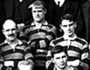
1930s
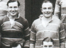
1950s

1960s

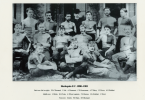
Granted, I can't see anything for Northampton from pre WWI era; but looking at what pictures I can find from the Victorian era - only international teams seemed to have a logo/badge.
Just for example:
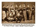
- Joined
- Aug 18, 2015
- Messages
- 10,371
- Reaction score
- 5,996
I hope you're not implying that instead of fans complaining about the logo not being the original they are instead complaining it's not the one they grew up with.Could you expand on this please?
Is that "it's the original logo" because it's also the first logo, with previous versions being a badge, not a logo?
From the Saint's own website, "our history" section
1910s
View attachment 24363
1930s
View attachment 24362
1950s
View attachment 24364
1960s
View attachment 24365
Granted, I can't see anything for Northampton from pre WWI era; but looking at what pictures I can find from the Victorian era - only international teams seemed to have a logo/badge.
Just for example:
View attachment 24366
View attachment 24367
I don't mind it. For me it's just a tad minimal effort and just ok.I like the new saints logo now, it's grown on me and to be fair it's not new, it's the original logo. Every club has changed the logo in the premiership in some way, some more dramatic than others though. It's part of life.
Maybe it is better for a brand recognition point of view. I just don't think it's better than the previous one. I like traditions and keeping things as they are. But that's a personal thing and me being a tad resistant to change for the sake of it.
I tend to think the Saints brand recognition is the black, green and gold. Which to be reasonable the new logo goes for
I'll need to dig out the propaganda they used when launching the new logo, but the original logo on shorts was that yellow cross thing. So that's the original shirt logo/ badge whatever we want to call it.Could you expand on this please?
Is that "it's the original logo" because it's also the first logo, with previous versions being a badge, not a logo?
From the Saint's own website, "our history" section
1910s
View attachment 24363
1930s
View attachment 24362
1950s
View attachment 24364
1960s
View attachment 24365
Granted, I can't see anything for Northampton from pre WWI era; but looking at what pictures I can find from the Victorian era - only international teams seemed to have a logo/badge.
Just for example:
View attachment 24366
View attachment 24367
Edit: from the saints historian:
‘The earliest team photo we have was taken in 1884. Back then, they were called St James Improvement Class, playing at various fields around St James and on the Racecourse. On the front of some of their jerseys, you can see this emblem. We can't be certain why they chose it, as no definitive explanation exists, but it's very likely this is a link back to St James' Church, with the emblem being a rough version of the St James Cross. Reverend Wigg himself mentions that his mother made crosses for the senior boys in the class to wear.’
Apparently our first kits were scarlet as well.
Last edited:
- Joined
- Apr 12, 2015
- Messages
- 7,569
- Reaction score
- 5,285
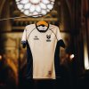
Hahahahahahahaha that might be the worst kit I have ever seen
Already wet themselves at the thought of playing a Champions Cup knockout game
Already wet themselves at the thought of playing a Champions Cup knockout game
- Joined
- Apr 12, 2015
- Messages
- 7,569
- Reaction score
- 5,285
I don’t think any photos of the back have been released yet, so I have to assume that the shorts have a brown streak running down the middle of them.Hahahahahahahaha that might be the worst kit I have ever seen
Already wet themselves at the thought of playing a Champions Cup knockout game
Saints have gone **** yellow this year. Must be in vogue.
Saints kits bad but it's not Leinster bad.
Saints kits bad but it's not Leinster bad.
Best comment read today
Looks like a **** poured pint of fosters.
Looks like a **** poured pint of fosters.
- Joined
- Nov 25, 2018
- Messages
- 2,522
- Reaction score
- 2,578
Otherwise known as a pint of Fosters.Looks like a **** poured pint of fosters.


Sharks launch Hacienda-inspired away kit | Sale Sharks
Sale Sharks have revealed the club’s new Macron away kit, paying tribute to Manchester’s rich musical history and one of the city’s most influential figures. The new design is inspired by the iconic Hacienda Nightclub chevrons, made famous by the legendary Manchester music venue which closed in...
 www.salesharks.com
Hacienda chevrons and the colour of Vimto - not mad at it
Could tell it was Macron by the neck.
I can get behind the Madchester inspired look being a fan of that era's music. I like it.
I can get behind the Madchester inspired look being a fan of that era's music. I like it.
- Joined
- Apr 12, 2015
- Messages
- 7,569
- Reaction score
- 5,285
Yeah not fond of the collar but I like the kit design itself


