• Help Support The Rugby Forum :

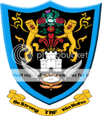
TRF Coat of Arms

B

Bullitt

Guest
Being as all we have is the ball as a logo.
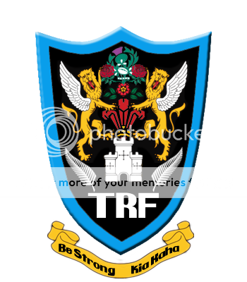
trfcrestcopy-1.png
 
God sake! I used the f***ing lions and only the f***ing lions. Any lions would have done.
 
God sake! I used the f***ing lions and only the f***ing lions. Any lions would have done. [/b]
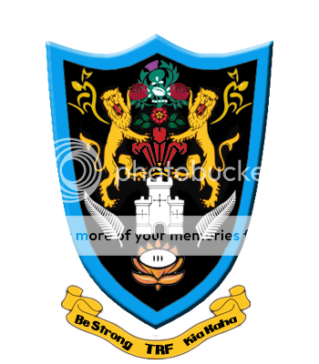


LOL....and the castle? :ph34r:


Nothing wrong with it, just a huge Saint and AB influence...If I created it it would've had 2 horns and a bullring, and a springbok, maybe some beers on the side. :bleh!:
 
I actually really like it. I'm, obviously, into all that sort of stuff, but great work, Teh Mite. What did you use to make that?
Anyway, I think if they ever gave the place a face lift, that'd be a great logo to use.
My only suggestions would be firstly in regards to the motto 1. be in in Latin only 2. be longer (more text).


And maybe, just maybe make the IRFU logo a wee bit larger? Possibly adding a dragon, as in one lion, one dragon? (see img. below)
south_glamorgan.JPG
 
I actually really like it. I'm, obviously, into all that sort of stuff, but great work, Teh Mite. What did you use to make that?
[/b]

You mean aside from a jpg of the Saints badge?

Good effort though...Wasps & The Bulls should included too as respective hemispheric champions
 
I like it, nice work teh mite. Only two things I can pick up.
1) The black background with blue border don't look right
2) I would keep the same shorter height as the latest badge you have done, the first on was a bit too long.

It looks difficult to fit everything in the badge, but creating something like the Vale of Glamorgan logo posted by O'Roth will help to get everything you want into your badge.
 
I like it, nice work teh mite. Onlu two things I can pick up.
1) The black background with blue border don't look right
2) I would keep the same shorter height as the latest badge you have done, the first on was a bit too long. [/b]

Needs the France badge where that castle is I think
 
The Supporting Characters should technically be on the outside (ie the lions). Then the inside should be quarterd in order to show all the representative bodies (ie RU/RL, home nations, ect.).
 
lol, why dont we just chuck every badge from every nation and every club including league in there?

i honestly dont think it should ahve too much stuff in, just keep it simple. if you keep adding stuff its going to be way to much work for Teh Mite and its just going to be all cluttered and not worth it.

just my two cents.
 
I see a lot of references to england and kiwi rugby, but not much of aussie rugby. that's too bad ! :)
 
we defo need a new logo

the ball is pretty lame!!

we need something iconic like coca cola or mcdonalds

we do need a new logo
 

Latest posts

Top