• Help Support The Rugby Forum :

Club Kits

The Rugby Forum - Global Rugby Union News, Six Nations & RWC Discussion

Help Support The Rugby Forum:

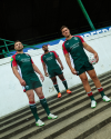
SALE-SHARKS_HOME-KIT-25_26_ROB-DU-PREEZ_RAFFI-QUIRKE_JOE-CARPENTER_0521-768x512.jpg


SALE-SHARKS_HOME-KIT-25_26_HOLLY-THORPE_STUDIO_0805-768x1012.jpg


Not amazing, not terrible - though I still hate the collar on the men's shirt
The map on the side of the shirts/shorts is a map of Sale from 1861
 
SALE-SHARKS_HOME-KIT-25_26_ROB-DU-PREEZ_RAFFI-QUIRKE_JOE-CARPENTER_0521-768x512.jpg


SALE-SHARKS_HOME-KIT-25_26_HOLLY-THORPE_STUDIO_0805-768x1012.jpg


Not amazing, not terrible - though I still hate the collar on the men's shirt
The map on the side of the shirts/shorts is a map of Sale from 1861
Now the Miami Sharks are no more, maybe taling a similar template on navy and white would have worked better.
 

Attachments

  • images.jpeg
    images.jpeg
    13.5 KB
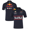
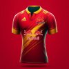
Yeah I didn't realise Red Bull have a history of changing their sides to red and white, which will also be annoying because if they do it with Newcastle they'll be changing to Gloucester's colours
 
Loving the new club badge and the thought process behind it. Also the new kit is fantastic, a nod to the past also, using the Black & Gold
 
What's the thought process?
Also happy for Newcastle that they've kept the black

The new club crest encompasses the North Star, reflecting Newcastle Red Bulls' status as the league's northernmost club as well as giving direction.


The dynamic bulls represent the driving force with the club always moving forward, with other elements of the design incorporating a rugby ball and the Tyne Bridge.

As well as the black home kit, Newcastle Red Bulls have also unveiled their gold away shirt, demonstrating a proud connection with the club's professional history.

The club wore black with gold trim in lifting their 1997-98 Premiership title – still the only team ever to win the top-flight crown the first season after promotion.
 
The new club crest encompasses the North Star, reflecting Newcastle Red Bulls' status as the league's northernmost club as well as giving direction.


The dynamic bulls represent the driving force with the club always moving forward, with other elements of the design incorporating a rugby ball and the Tyne Bridge.

As well as the black home kit, Newcastle Red Bulls have also unveiled their gold away shirt, demonstrating a proud connection with the club's professional history.

The club wore black with gold trim in lifting their 1997-98 Premiership ***le – still the only team ever to win the top-flight crown the first season after promotion.
TY.
I'm sure it'll grow on me - doing a sports logo must be a thankless business - I can't think of an actually good one that isn't pre-existing with a long history.
 
WhatsApp-Image-2025-09-09-at-14.52.30_01379827.webp

Photo-08-09-2025-09-00-43-1.webp


Not bad tbf, certainly not as bad as it could've been

Agreed, with the exception of the badge which to me should be a sacrosanct consistent identifier.

It just screams franchise to me. And while RB may be a long term investor who will do a lot of good, one day they will leave the stage and a new identity will have to be created. A nod back to heritage whether Falcons or earlier would have been the classy thing to have done.

But that’s the era Newcastle find themselves in and they weren’t exactly in a strong bargaining position.
 
The new club crest encompasses the North Star, reflecting Newcastle Red Bulls' status as the league's northernmost club as well as giving direction.


The dynamic bulls represent the driving force with the club always moving forward, with other elements of the design incorporating a rugby ball and the Tyne Bridge.

As well as the black home kit, Newcastle Red Bulls have also unveiled their gold away shirt, demonstrating a proud connection with the club's professional history.

The club wore black with gold trim in lifting their 1997-98 Premiership ***le – still the only team ever to win the top-flight crown the first season after promotion.
Should have gone for the Newcie Brown Star with the Tyne bridge.
 

Latest posts

Back
Top